
MY ROLE
0-1 product design
Cross-functional team leadership
TEAM
Scott, design
Allison, product
Manny, engineering
Noel, UXR
Lindsey, content
Grant, lexicography
Jess, marketing
TIMELINE
12 months
RESULT
Company acquisition
3 product launches
Subscription revenue
📖 5 minute read
Summary
I led a new cross-functional education technology team with a process dedicated to improving student outcomes, clear strategic direction, and experienced 0-1 product development. My background in lean startup methodology and work in the edtech industry contributed to multiple successful launches, elevating the project and building internal momentum for a creative, result-focused culture.
Diversifying revenue
Serving 1.8 billion lookups every year, Dictionary.com is one of the world’s most popular online vocabulary tools. With upcoming restrictions on third-party cookies looming over the company’s ad-supported model, the company was determined to expand into new markets and other forms of revenue.
Specifically, this included an initiative to secure recurring revenue via monthly subscription. Once Dictionary.com identified education technology as a well-aligned opportunity for this goal, I was hired in-house as the senior designer over the project.
Contributing as a design and product leader
At the time I was brought on, the edtech project was still at an early stage, lacking specific product direction. Drawing on my experience as a design lead for startups, I jumped in and worked with the product team to define a strong vision:
Leverage Dictionary.com’s content, brand, and in-house talent to create an engaging vocabulary practice experience that positively impacts student educational outcomes.
For me, this involved stepping up to take a primary role in both product and design:
- Guiding cross-functional discovery sessions
- Analyzing competitor offerings
- Refining concepts into product pitches
- Developing strategy alongside executive leaders
- Establishing and nurturing stakeholder alignment
- Creating clear product requirements
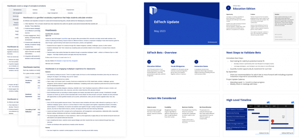
Sample of product work I helped guide and create.
“Scott went above and beyond the design role as a product development partner. He started by putting stakeholders at ease & driving helpful discovery sessions on what our edtech product could be. He continued to bring this strength with him to more difficult conversations with stakeholders & leadership as the project progressed. His passion and enthusiasm to build a product that helps and engages users was contagious.”
– Allison M, Group Product Manager
Developing a roadmap
After further development of our product pitches, it became clear that regardless of what we were going to build, the immediate business goals wouldn’t support a lengthy R&D process. To break down our project into intermediate steps and build towards our long-term goals, I helped shape the following product roadmap:
1
Improve the login/signup experience
Including the addition of Google SSO
2
Remove ads across the site via monthly subscription
To meet school expectations of a distraction-free learning experience
3
Implement safe browsing for students
Block some dictionary entries to help students stay focused
4
Develop a high-impact personalized vocabulary practice tool
To meet students where they are and guide them to improved outcomes
As work on the first three steps commenced, I simultaneously led the Dictionary.com team towards creating our engaging vocabulary practice tool.
“Scott has been an exceptional thought partner for the Product team, and we have all been impressed by his ideas and design skills. I especially appreciate the level of enthusiasm and innovation Scott brings to each project he is tasked with. He is adept at translating complex concepts into designs that illustrate and effectively sell the objectives of each initiative.”
– Allison T, VP Product
Identifying problems to solve
First, I needed better information regarding the challenges that students face in vocabulary instruction.
I worked with the product team to examine the competitive landscape, develop strategy, and gather insights about student needs, preferences, and behaviors. To deepen our understanding, I collaborated with our UXR team to structure, observe, and conduct in-depth interviews with parents, teachers, and key administrative decision makers. I also accompanied the edtech team for a series of classroom visits in San Francisco.
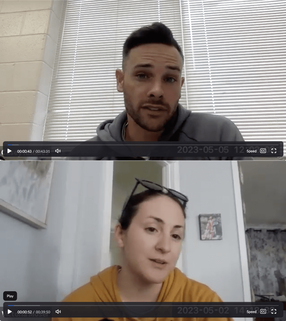
User interviews with parents, teachers, and district administrators.

Classroom visits at West Portal Elementary.
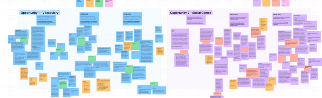
From these observations, I compiled our learnings into three problem statements:
BOREDOM
Students are bored with traditional vocabulary instruction methods, and do not feel motivated to learn new words.
FRUSTRATION
Students are frustrated with vocabulary instruction that does not convey why given words might be relevant to their lives.
COMPETENCE
Students do not feel confident in their practice and application of vocabulary learning, which can cause feelings of inadequacy and intimidation.
Establishing goals and design principles
Our research uncovered many exciting avenues for edtech products at this moment in time, including concepts like gamification, microlearning, personalization, and AI – but I knew it was important to keep our efforts focused on reliable outcomes. After discussing, evaluating, and establishing alignment with project stakeholders, I framed our goals as specific solutions to the pain points found in the general vocabulary instruction experience:
MOTIVATION
Disrupt currrent vocabulary instruction methods to make learning more engaging.
RELEVANCE
Help students make meaningful connections to the material, increasing focus and retention.
CONFIDENCE
Use adaptive and personalized techniques to increase student comfort and confidence.
As we headed out of the product development phase and into the design process, I needed to set some ground rules for my approach.
Type-focused visual design
As our vocabulary product centers around words and definitions, a focus on beautiful typography is a must, and we will avoid cluttering the visual design with distracting elements.
Comfortable pacing
Especially when designing for variable age groups, we will maintain a low cognitive load approach as much as possible throughout the experience. We will prioritize effectiveness over efficiency.
Scope limitations
In addition to a simple experience that supports a flow of learning, we will avoid adding trendy and extraneous features that sound cool but may distract from the core educational loop.
Evaluating a legacy system
With a right-sized and collaboratively-aligned product direction established, I began to further evaluate the existing experience. Our team was under pressure to innovate with tight constraints, so if there was anything usable in Dictionary.com’s legacy systems, now was the time to find out.
I was pleased to discover that although hardly anyone knew it existed, a functional word list feature and some basic study tools had already been built sometime in the past. The usage on these features was incredibly low, having not been developed for any specific audience, as well as featuring an unclear and disengaging workflow.
Working together with the product team, I audited the capabilities of these features and documented what could be repurposed for our vocabulary practice tool.
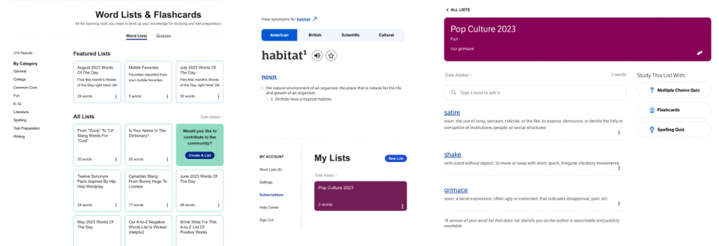
Browsing, managing, and viewing word lists from the legacy experience.
Through this evaluation, we identified several critical areas where the existing features failed:
- Lack of a compelling, repeatable workflow
- Disorganized browsing and curation
- Unclear process for creating and managing lists
- Confusing and ill-suited page hierarchy
- Rudimentary and ineffective study experience
Reinventing the user flow
Even with some of the features already built, we needed to present a much smoother workflow for students to receive meaningful benefits from the experience. I started by mapping out an ideal future state of what our student journey could look like, as well as working with the product team to start identifying possible user flows around study and practice.
At this point, I also developed a more robust educational loop: what kind of experience would keep a student excited to come back to our product each day, and what would motivate them to get more out of each session?
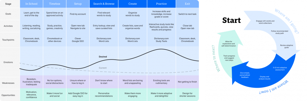
New student journey and educational loop.
To begin answering these questions, I distilled our explorations into three design goals:
- Develop a smooth, replayable workflow
- Rebrand word lists to be more personal and engaging
- Augment our study tools into one adaptive quiz experience
Plans become pixels
With these guidelines taking shape, I began to put together a variety of vision mockups, wireframes, and prototypes for internal discussion and refinement.
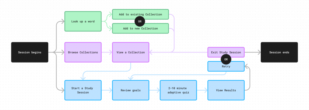
Exploration for simplified, replayable workflow.
Early vision mockup for word lists, rebranded as Word Collections.
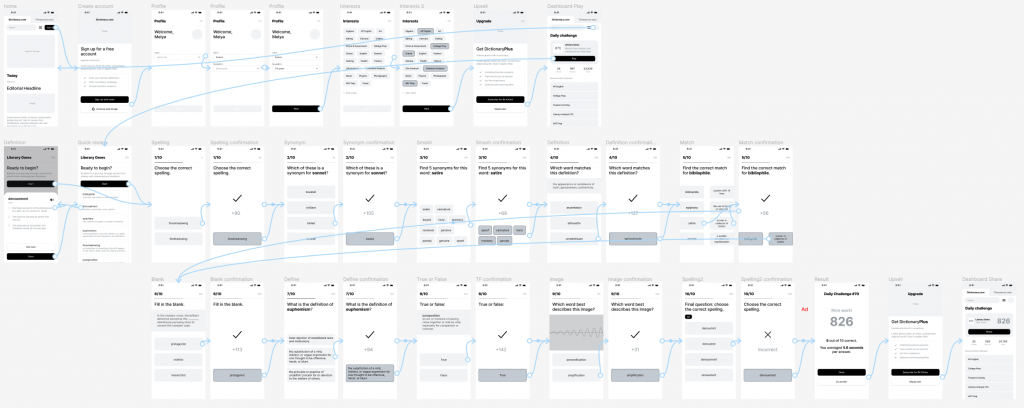
Prototype for adaptive quiz experience, branded as Study Sessions.
Preparing for development
After feedback from project stakeholders and executive leaders was weighed and prioritized, I began to finalize revisions and produce engineering-ready design specs.
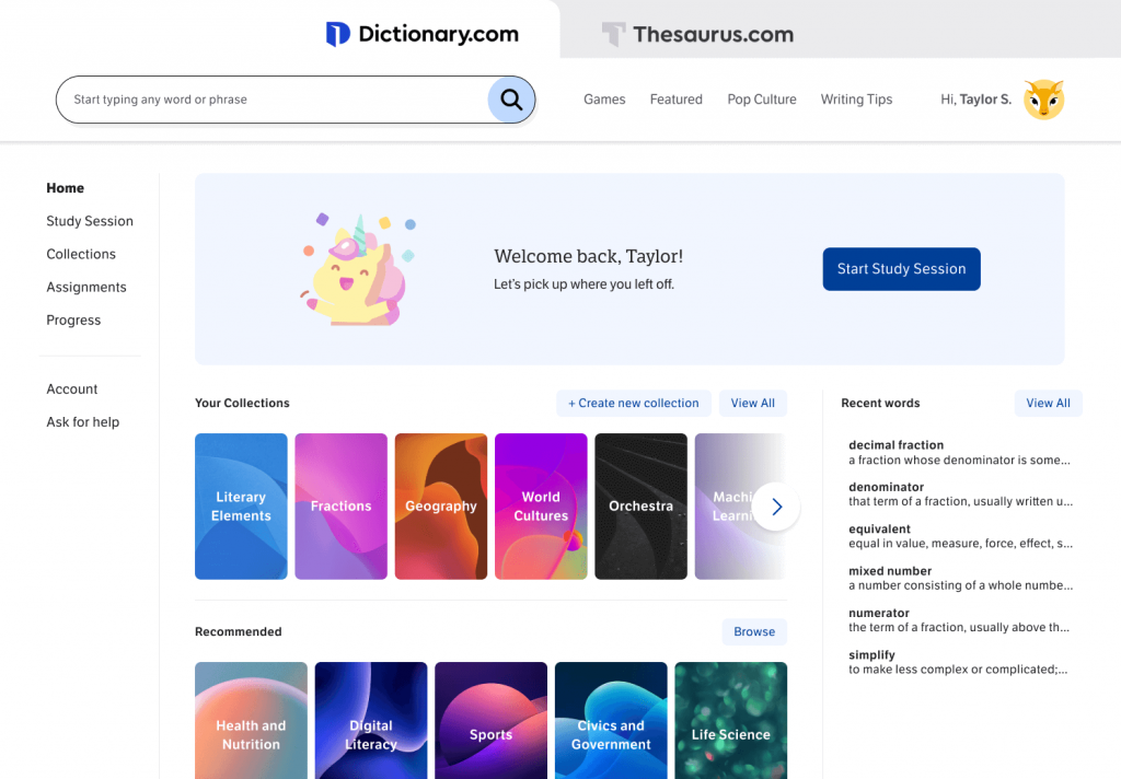
The browsing experience was upgraded in several ways:
- Redesigned to serve as a dedicated student dashboard first, browsing second
- Matched left nav styling to other page templates for consistency
- Improved typographic hierarchy holistically and within components
- Enhanced word collection tiles with a progress bar and more meaningful visuals
- Added categories for browsing curated recommendations
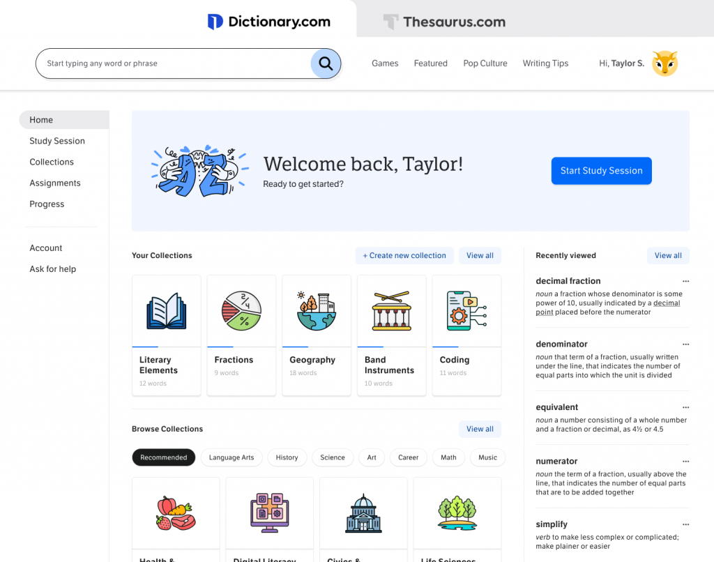
Student dashboard/browsing experience.
I gave the old word lists a full redesign, including:
- New branding as Word Collections
- Populated the left nav with the user’s other word lists, for easy switching
- Heightened visibility for accessing the new Study Sessions feature
- Improved typography holistically and within page components
- Added a detailed progress ring with simple, positive messaging and goal-setting
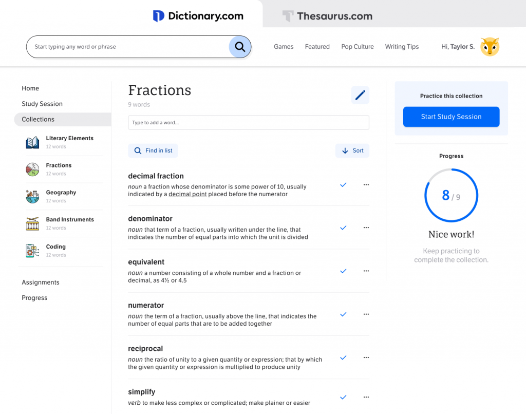
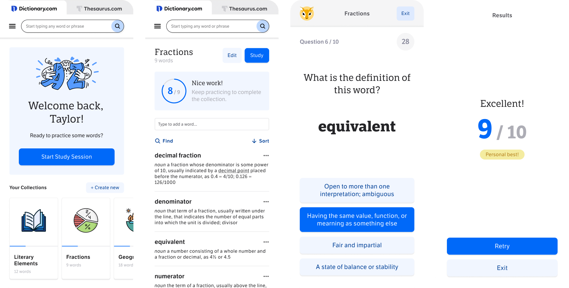
Word Collection.
I consolidated the old study tools into a new feature called Study Sessions:
- An all-new guided quiz experience with a series of timed questions
- Words from the selected Collection are presented with a variety of question types
- Adaptive word frequency to address student needs by visiting missed words more often
- Lightweight assessment experience to maintain low cognitive load
- Laid the groundwork for future social/multiplayer features
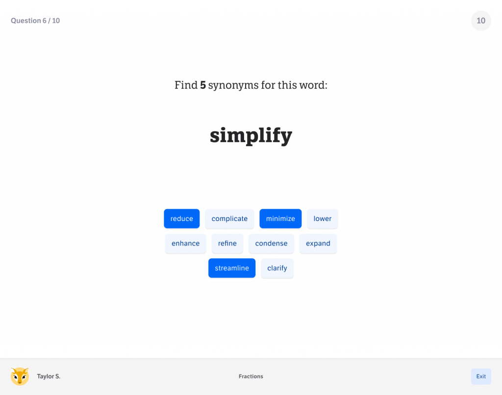
Study Sessions: a variety of timed question formats in sequence.
Result
At this point, internal anticipation for the new vocabulary practice product was high. Reviews from stakeholders, including parents and educators, spoke to the comprehensive process and potential for positive student outcomes. We successfully launched three steps on our roadmap:
- New signup process (increased signup rate by 20%)
- Ad-free subscription (generated recurring revenue)
- Safe browsing (distractions minimized by 30%)
However, in a surprising twist, Dictionary.com was acquired by IXL – a leading company in the education market. The energy around our edtech project spoke to a well-aligned merger, with one wrinkle: IXL’s portfolio already included Vocabulary.com, an excellent and well-received vocabulary practice tool for students.
The new executive team expressed admiration for our work, and ultimately explained their intention to take the company in a different direction. With Dictionary.com strongly positioned to find a new path forward in the market, the edtech team was disbanded.
Reflection
I am deeply appreciative and proud of the collaborative effort and dedication that I helped nurture within the company for making a positive impact on student outcomes. My team performed at an incredible level of talent, precision, and creativity, and helped me become a better leader through patience, participation, and genuine feedback.
Sample of mobile designs.