MY ROLE
Strategy
0-1 product design
Cross-functional collaboration
TEAM
Scott, design
Allison, product
Heena, engineering
TIMELINE
4 months
RESULT
3x paid subscribers
Revenue diversification
Minimizing distractions
After implementing an improved login/signup process for Dictionary.com, I started looking at the next step in the edtech project roadmap: creating an ad-free experience for paid users.
I knew from our interviews and past experience with educators that this would be a table-stakes feature for school districts. While work continued on a more student-focused product in parallel, my team opted to build and release a general-use version of the paid subscription to start lean, collect revenue sooner, and gather feedback more quickly.
Defining objectives
The were three main design challenges for the ad-free soft launch:
- Gracefully removing ads from newly-redesigned page templates across the site
- Create an effective call to action for potential subscribers, with little-to-no marketing spend
- Create a high-converting plan selection page and payment flow
Removing the ads
Dictionary.com had been aggressively filling their pages with a high number of ad placements to maximize revenue from page views. Although I frequently raised concerns about the long-term sustainability of this strategy, I was glad that we were going to be building an ad-free version of the experience for a reasonable subscription fee.
After surveying the site in tandem with the engineering team and identifying where to start, the first step was designing the ad-free versions of two major page templates: the Homepage, which contained a mix of featured content types, and the Results page, which presented dictionary entries and other associated content.
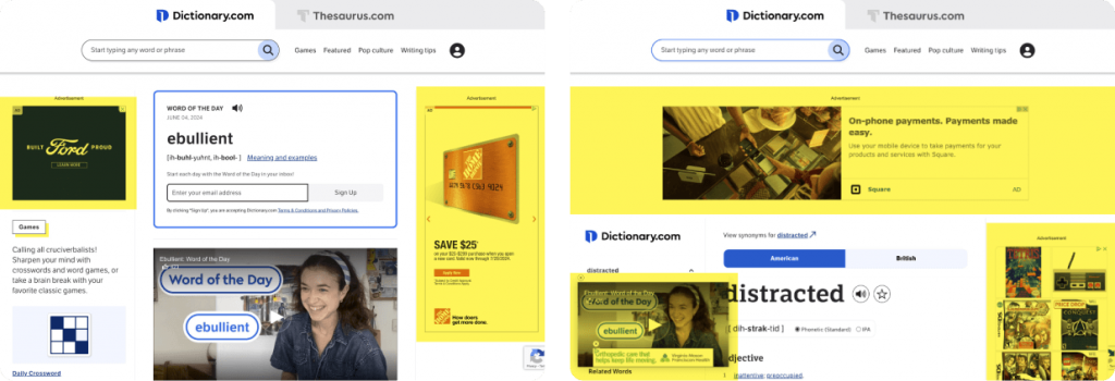
Existing page templates, which had become inundated with ad placements.
This mobile solution was fairly straightforward. With content in a single column, ads could drop in or out of the layout with little disruption. However, on larger screen sizes, both templates featured a three-column layout with a dedicated right rail solely for ad placements. After discussing options with the team, it came down to two possibilities:
- Shift to a two-column layout by removing the right rail completely, or
- Repurpose the right rail to display other relevant page components
To set the groundwork for surfacing meaningful content faster, I advised the team to move forward with the latter.
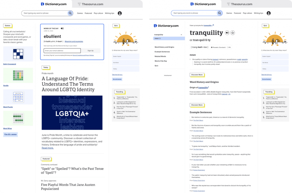
Updated ad-free templates, with repurposed right rails.
Guiding users to subscribe
As this was meant to be a general soft-launch in preparation for our future edtech offering, I had to figure out a way to effectively invite users into the subscription flow with no marketing budget. After referencing subscription C2As for popular services like Spotify and YouTube, this narrowed it down to some fairly unattractive options:
- Add a large C2A section on the homepage, either in the body content or as a rotating promo banner, which seemed ineffective due to inconsistent visibility
- Replace one of our ad placements with a static C2A, which seemed inadvisable due to a negative impact on revenue
With neither option appearing viable, I broadened our reference pool to other comparable experiences, particularly paid news sites. This gave me an opportunity to study how they had successfully implemented a low-profile invitation to potential subscribers. I quickly noticed a common UI pattern: adding a simple Subscribe button in the header, next to an authentication button.
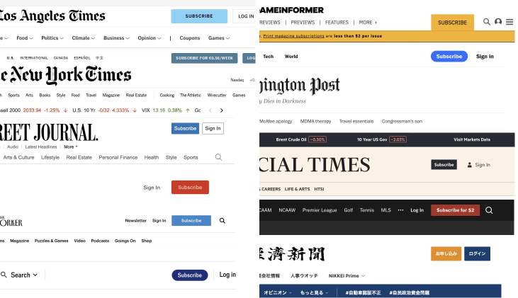
Reference: subscription C2As on highly popular paid news sites.
Feeling like I had discovered an elegant analog to our desired solution, I began exploring how a similar configuration might appear in our site header.
Dictionary.com’s site header had a widely-disliked profile avatar icon that was being used as a login button. It didn’t take much convincing to discard the icon in favor of a standardized C2A button. I knew that as users scan the top of a page, attention often settles for a moment at the right side of the screen – so I intentionally arranged the buttons in a Login-Subscribe order, to draw just a little more attention to the new offering.
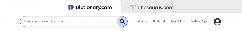
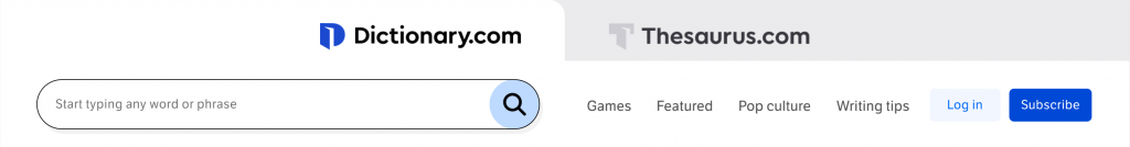
Desktop header design, before and after.
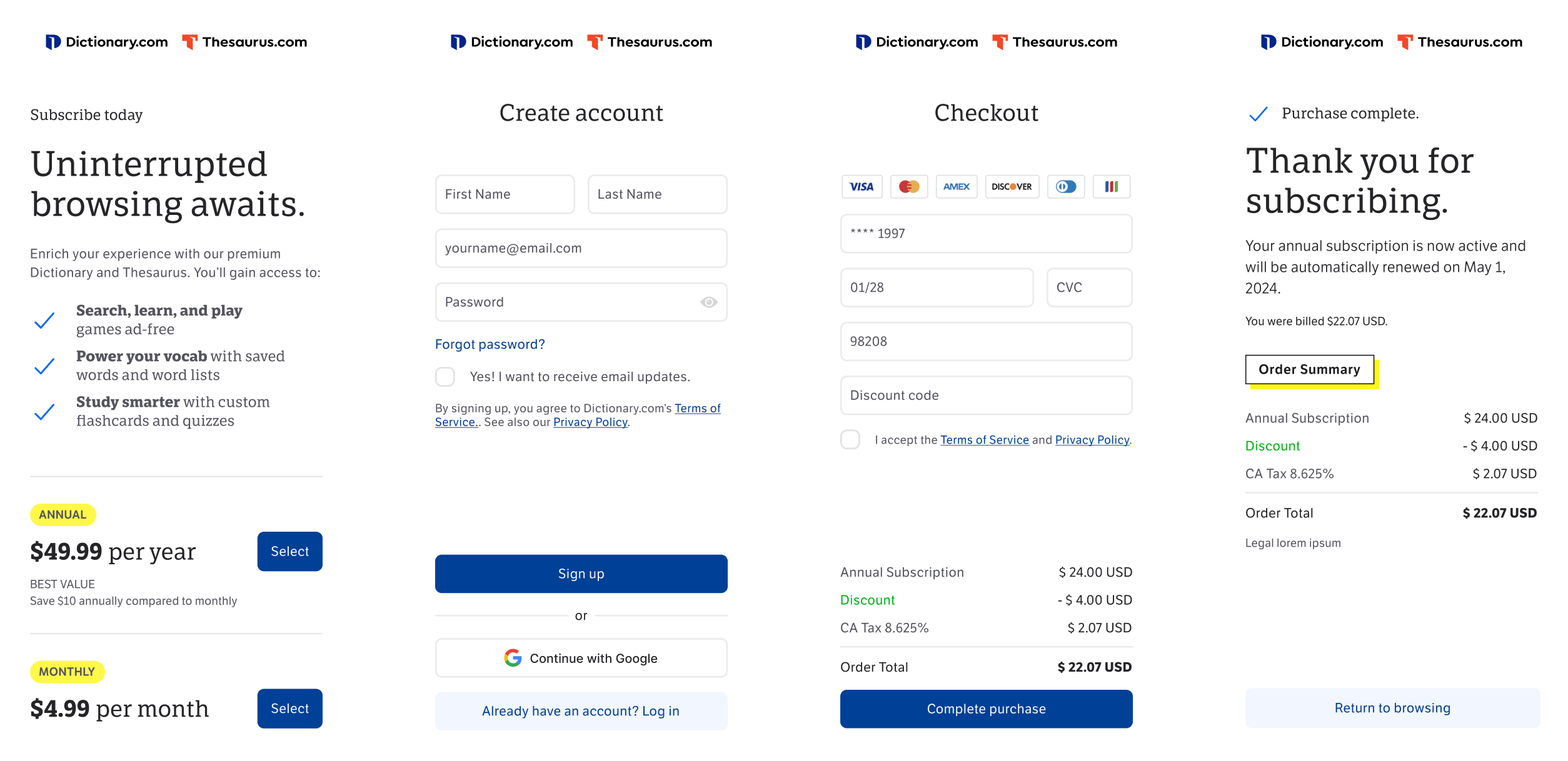
Building the checkout flow
We needed four designs for our basic payment flow:
- Plan selection page, with monthly and annual payment options
- Create an account, if they did not already have one
- Payment information, with an input for discount codes
- Confirmation, to let the user know the transaction was successful
As the plan selection page was a brand new page with no obvious reference points in the rest of the site, I turned again to publishers and paid news sites for inspiration on how to best construct this experience. What I found was a fairly predictable pattern: short, spirited marketing copy; clear options to choose from, and an upbeat visual design hinting at a premium experience.
After creating, reviewing, and establishing alignment around the wireframes for the experience, I initiated a few important collaborative efforts:
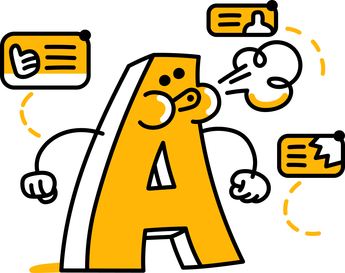
Upbeat visual design
I worked on art direction with our brand designer, engaging a lively and talented artist to develop a comical character blowing away pesky advertisements like bugs.
Spirited marketing copy
Then, I worked with our expert writers on the content team to improve my outline for the marketing and button copy.
Tracking and adjustments
Lastly, I tee’d up our analytics team to do some A/B testing on the effectiveness of the illustration in contributing to conversions. As a result, we discovered a concern: on desktop, the illustration seemed to have little effect on conversions, but its presence on mobile was pushing the plan selection buttons below the initial viewport, leading to a dramatic drop in both visibility and conversion rate. We quickly course-corrected by hiding the illustration on mobile screens, and immediately saw the conversion rate return to a more positive range.
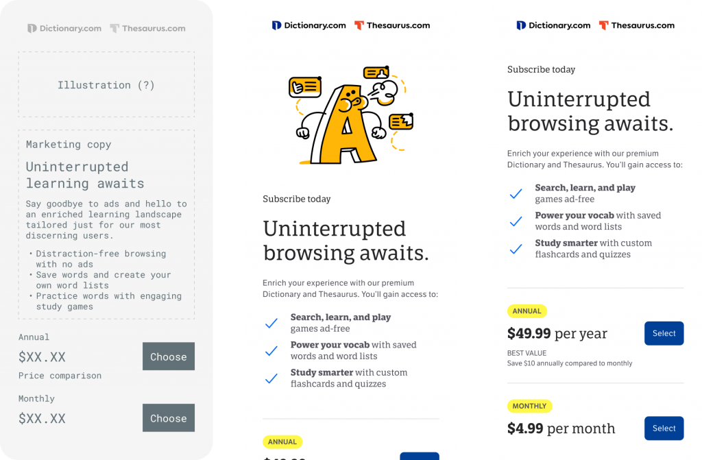
Wires and design for the plan selection page, with/without illustration.
Since I had already completed a redesign of the account creation experience earlier in the roadmap, I could move straight to the payment information screen.
With that already in place, I began working on the payment information screen next. Taking cues from the redesigned account creation layout and style, I prepared a simple design according to the requirements. A few notable revisions between wireframe and final:
- The title was changed to “Checkout” to be more concise and clear about what was happening on this screen.
- An order summary was added, to remind the user of what they were purchasing and its total cost.
- The CTA terminology was changed from “order” to “purchase” to avoid confusion about it being a physical product.
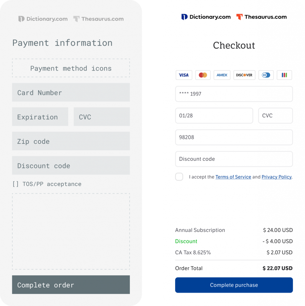
Wires and design for the payment screen.
All that remained was to put together a clear, friendly confirmation page to reassure the user that the transaction had successfully processed and they were now in the ad-free version of the site.
A particular discussion arose around the question, “Where do users expect to be taken after completing the subscription upgrade?”
After considering several options, referencing comparable experiences, and gathering user feedback, I proposed that rather than forwarding the user to a specific destination, we simply track the page they entered the payment flow from and return them there, thus closing the loop and contributing to a more seamless experience.
This also helped me make a determination on whether or not to keep the social share prompt, which was ultimately removed to prevent users from getting stuck or lost at this step, and introduce them to the ad-free browsing experience as quickly as possible.
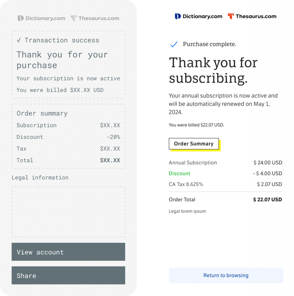
Wires and spec for the confirmation page.
I also created designs for the management of subscriptions under the Accounts experience.
Result
The ad-free subscription launched in January 2024, and garnered 3x as many subscribers in its first week than Dictionary.com’s previous subscription product had in total. Due to the great demand for this option, the product immediately began generating recurring revenue, and was considered a successful preliminary step towards our edtech offering.
Final mobile designs.